Reflective Journal
4th Sept 2014
Where do you begin a journey? The start is always advisable I find, today saw a journey begin for me, having received our first project ‘Dimensional Shift’ back on Monday and because of work commitments and unable to join the group until today, mid project if you like, I found it extremely nerve racking joining my group, with trepidation, but thanks to the lovely Cheris, Mia and Ellie I soon fitted in well, I was made to feel welcome and asked for input straight away. The girls had started on a piece influenced at that stage by Ellie’s summer project, it was described to me as a silhouette piece made from 12 pieces of mixed colour card, brown, blue, grey, brighter yellows and pink at the top of the piece making up the forehead, broken down on the right side with white eye sockets, it was not immediately obvious to me what the representation was, who it was, what it meant so I asked the questions “what does it represent” “ who does it represent” “where were you planning to go with it” the girls said they were a little stuck and needed some input, a mixed feeling of dread and pressure came over me, but Ellie came to the rescue as she explained the influence was mainly from her summer project, John Lennon.
 |
| The piece in progress |
At that point I had a big internal mindful sigh of relief, I can go with this, although initial the girls were looking at a more personal piece away from the celebrity I suggested that we go with the personality of John Lennon, that we should make the piece darker and work on representing his beliefs and how that contrasts with the violence of his death, so the work I helped produce is titled Bigger Than Jesus, when we first discussed the title Mia suggested a song title, the obvious being Imagine, in my mind I thought this would be to safe and suggested ‘Bigger Than Jesus’, influenced from Ellie's researching the history of John Lennon, she had put together a lot of research, she was telling us about it at the time we decided to go forward with the harmony and violence theme, Cheris and Mia were not familiar with John Lennon and helpful both artists where brought up to date during the conversation, Ellie mentioned that when asked by a TV journalist about how famous the Beatles were John Lennon remarked “We are bigger than Jesus” Unknown to him that remark was his death sentence. The piece is about the contrast of John Lennon’s humanity and harmony and the violence of his death and on reflection on what an individual says can, even a throw away statement or humorous quip can change a persons life path.
 |
| A section of the piece in progress, close up of the inter twined arms and legs falling away. Represents harmony falling away in death |
Once we had decided as a group in what direction to go in and having the piece started with the influence from Ellie’s summer project I made the suggestion of adding some darker aspects from my summer project, from David Drowning In Grief I drew from the cut out influence, in turn influenced by Matisse’s cut outs, breaking the piece up, I suggested we run with the idea of flesh coloured cut out arms and legs inter twined the images falling away, the idea was from the photographer Annie Leibovitz famous Rolling Stone cover of John and Yoko in a loving embrace, we glued the collage down, I was nervous it wouldn't work as we only had female autonomy to work with but it turned out OK, if I was do it again I would use more images of male arms and legs. Another influence from my summer project was again the use of cut-outs used in the hair and glasses of the piece this worked really well because of the elements of Ellie’s summer project, she had used patterns and colours from the 70’s, I suggested we should construct the glasses and hair from those elements. Photo copies were made in a green and yellow tone. I loved the hair, that worked really well however I wasn’t happy with the glasses totally, I feel they could have been bolder, out of proportion even, the eyes are an important area in portraits and if I was to change the piece that would be it, bigger, bolder. We used acetate to represent shattered glasses, a brilliant idea from Cheris, it just wasn’t bold enough.
 |
| Finished Piece, Bigger Than Jesus |
Over all the finished piece was OK it communicated what we set out to a level, a shift from peaceful harmony to a violent end but I do think it could have been bolder, I would have like to have added large crimson bullet holes throughout the image, brighter crimson splatters. We did add quite a bit of dark watered down red to represent blood, just not quite enough. One bold step I took was adding red paint with a 2” brush, horizontally across the foot of the piece again a blood theme, on reflection when we hung the piece it did look like a blood soaked US flag, an unintentional twist, John Lennon died on the streets of New York.
A brief note on a couple of problems, because we used quite watered down paint the moisture soaked up by the card caused the card to curl as it dried, we solved the issue by re gluing. We also had a rip in the bottom right hand corner, I taped this up on the reverse.


A brief note on a couple of problems, because we used quite watered down paint the moisture soaked up by the card caused the card to curl as it dried, we solved the issue by re gluing. We also had a rip in the bottom right hand corner, I taped this up on the reverse.
8th Sept 2014
Visual Studies
Before today
I had never used charcoal as a medium even though I’d had a box sitting in my
art draw at home for a good few months, so I was delighted to be given the
chance to use it. The project today was one of evolving drawing and sketching exploring
the use of charcoal and new for me on an A1, A0 scale. Sketching on this scale
I found very difficult never having attempted it before, the biggest sketch I
had ever done up to today was A2, coupled with the use of charcoal and the
daunting still life we were asked to draw added to the difficulty
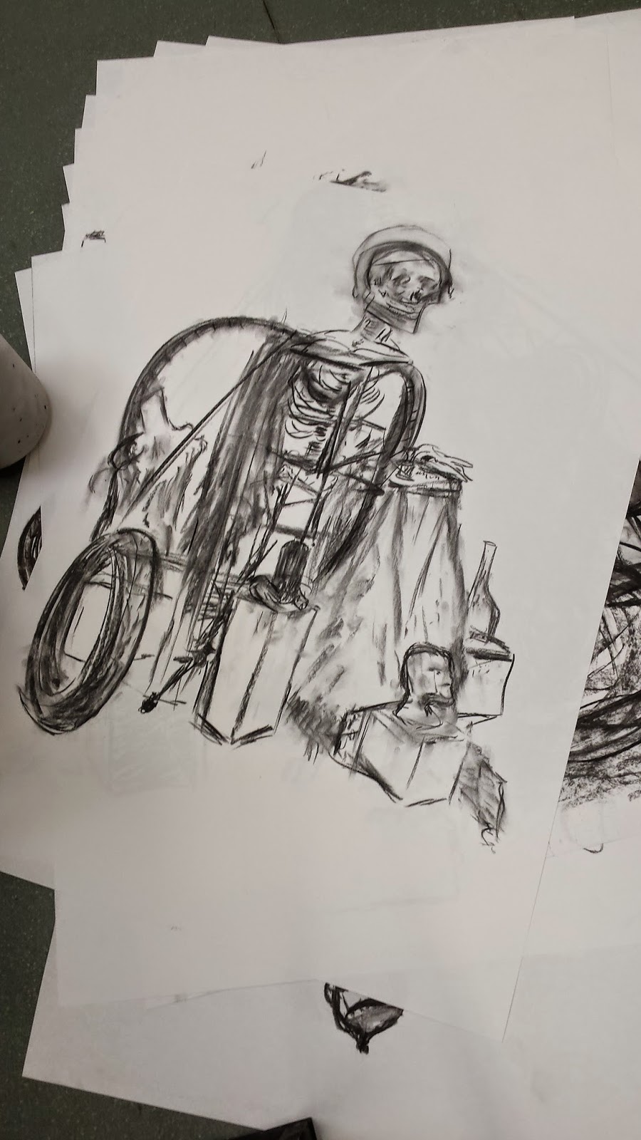 |
| 1st sketch |
My first
sketch, A1, produced in 30 minutes had good elements to it, I was happy with
the perspective on the bottom left-hand side, the tire, the central box construction
worked well as did the effect of the draped fabric, but overall I was disappointed
with the effort, the skull was out of proportion, the image sat to high on the
page. I felt awkward with the medium, I was using a small size charcoal and
would have probably fared better with a larger size stick, which I did use in
my final sketch.
 |
| Continuous line sketch |
The second
sketch was a continuous line sketch, a 10 minute project, I was not comfortable with this at all, doubled
the size to A0, talk about being thrown in at the deep end, I think I probably panicked,
I like nothing at all about the piece, I didn’t like the angle from where I
drew, it was very flat and I found handling the charcoal difficult, however one
thing taken from this and is the purpose of the piece, was to encourage a flow
to drawing, I can take that from it.
 |
| Third and 1st sketch, here I can see the improvement in scale and proportion |
The third sketch was a return to drawing one,
here we worked on A0 size paper and had an hour to complete a sketch combining
what we had learnt from sketches 1 & 2, adding more detail on a larger
scale. For this piece I played particular attention to scale, using a measure
on my rule of the skull and using that to divide the page into 6ths, also
adding a line at the top and bottom of the page area all helped to keep this
sketch in decent proportion and to scale. I also liked this sketch for the
detail I managed to achieve in the skull and tire. I did struggle with the main
skeleton, I initially made that too large which in turn caused the cube elements
to be too big, I remedied this by reducing the cube size which helped re scale
the skeleton and bought the piece back from being poor to one that had potential.
 |
| Sketch 4 |
For the
fourth and final piece of the day, again A0 size, we had beige paper and white
chalk added to our list of materials along with a re-constructed still life,
put together by us the students as a team. Knowing that I had re-occurring
scale and proportion problems in my previous 3 efforts I added additional lines
to the sides of the page as well as to the top and bottom, I also used a rule
to scale the piece. Adding the side lines really helped, the previous pieces problems
on scale was caused, in my opinion by incorrect proportions to the side. I
found adding those lines to the side helped with this sketch, although not completely
as the hips and leg area were to wide, I think caused by not stepping back and
looking often enough, slow to evolve this piece worked to a degree because of
the use on continuous lines on the tire, I found myself stepping back more as
the piece progressed, viewing and adding more and more lines adds a drama, as
mentioned on this piece I changed to a thicker stick of charcoal, it worked
much better adding thicker darker more pronounced
lines, it helped add to the drama.
10th Sept
2014
Graphic Design
Really
exciting project assigned today but I feel really daunted by the amount of work
involved, can I really do this? Today we have been assigned a project to
produce 3 designs for book covers from a list of six, Do Androids Dream of
Electric Sheep by Philip Dick, Lord Of The Flies by William Golding, The
Metamorphosis by Franz Kafka, On the Road by Jack Kerouac, Things Fall Aprt by
Chinua Achebe, Lost And Found by Oliver Jeffers and Life Of Pi. Initial
thoughts after reading the synopsis of each book is to go with Metamorphosis, a
story of neglect and change, of rejection I can certainly relate to it from a
personal point of view having struggled with rejection and loss in my own
family. Do Androids Dream of Electric Sheep, a story of deceit, finding love
losing love, set in a world after Armageddon when everyone craves ownership of
an animal, either real or android. But androids have to be eliminated, what or
who is, mistakes are made and consequences are cruel. 3rd choice is
on the road, I just love Americana and what is more Americana than a road trip,
the book tells the story of 2 lifetime friend and their adventures on several
trips, a complete journey of discovery.
Fine Art
Another
project assigned for fine art, along the themes for Lost and found, an
afternoon spent exploring the work of notable readymade or combine artists from
post modernism, such as Sarah Lucas, loved 2 fried eggs and a Kebab, made me
chuckle even though it is a serious piece about how women are portrayed, we
were asked to research and study a few artists from the period, Sarah Lewis
definitely, Anselm Kiefer for its starkness and textures, for colour I will
look at Jasper Johns.
What does
Lost and Found evoke, lots of suggestions from fellow students ones that struck
me mental stability, depression, personal loss, Identity, self-discovery all of
which I will take into my piece, an expression of life from death. Initial
ideas at this stage a collage of cut outs photos and sketches on a large scale
of wreckage from scrapped cars in a human form transformed to a clearer human
form, here are my initial sketches in charcoal, currently on 3 pieces A1, happy
with the way it goes at the moment.


Fine Art
15th Sept 2014
Visual Studies
A continuation of our last session, opening with the dreaded continuous line sketch, I detest this as I feel I have very little talent for it but it is good as a warm up. Another still life set up
So here is my continuous line drawing, really I do not like this but I do hope to improve, I see no improvement from my last effort, practice will make perfect, as it was pointed out today by Niel the tutor, drawing will get better the more you do, I believe him.
 |
| Continuous drawing 2 |
Our next drawing, not continuous this time, but with our opposite hand and not being able to claim I was ambidextrous this sketch is left handed. Interestingly I found this relatively enjoyable and in someways focused my mind to the task, working the other side, proportions were all out but the overall result was pleasing.
 |
| Continuous drawing 2 with the left handed effort |
The proportion issues is one that is gnawing at me but thankfully today Neil was too the rescue with today's main focus on just that and how to use a brush or anything else similar such as a pencil to measure scale. I was really pleased with the speed I picked this up, here is the next sketch just started.
I used the roll of paper in the still life as my guide and divided the length of the page into 1/4 's which worked out as 4 lengths of the roll of paper, the width I divided into 1/3's. I concentrated on the top mannequin and the roll of paper and worked out from there, overall very pleasing, a couple of issues, the roll of paper initial was too narrow, correct by thickening and a couple of shading problems solved by stepping back and looking, also I did have the top mannequins shoulders too wide, I bought those in a bit. Over all a nice result.
17th Sept 2014
Graphic Design
Busy day yesterday knuckling down ready for today and got busy with ideas, for Android, I was leaning towards having a literal representation for this cover so was looking at ways of combining robots and sheep and came across these two images on the web
A great image of a sheep, really different and the robot faces had so many different human expression I felt they were ideal, I wasn't sure how to use them so printed two different size pages and cut each individual out and collages them together, and got a great result, really spooky result, I was still having thoughts about how to combine the image of the sheep in, I did a few sketches on one or two ideas and came up this the single sheep and single android head, so cut the sheep head out and collage together with a single android head, I took that single piece of collage and added it (not glued down) to the main piece, yes it did look OK, but not great, how could I make it look better, taking influence from the Ridley Scott movie, Blade Runner and the sequence of an android running from a would be assassin I remember the android running through what looked like plastic films, perfect I added a layer of clingfilm over the collage, around the area of the sheep head I add scrunched up cling film and photographed it, the result I am really happy with, looking at adding robot programing language into the mix, but this is the result so far, every thing on this is working well at the moment
I did change it but not sure if I could run with this as a more SiFi look, on Photoshop I moved the saturation out as far as possible ? added in the robot language as well, really like the look and feel.
Really excited about the Metamorphosis progress, struggled with which direction to go in, I know it needed to start out as a collage, again book cover, should be literal ? I was out walking and picked up a few fallen leaves and bits of straw to play around with, can I construct an insect from these ? it really got me inspired, the colors were right for an insect I just need to get the form correct, reading the synopsis of the book I got the impression the insect was a cockroach/beetle type creature, so used this photo to help construct the collage
The result is this, all glued down as a collage, I did struggle with the straw legs they kept snapping when I tried to bend them, they were so dry, I did persevere and I am really happy with it
I completed a couple of human form sketches, one taken from a famous painting Flandrin, I liked the vulnerability and despair of the piece and another sketch from an image from my own photography portfolio, the form of the torso appealed. Again how do marry the idea with the insect. I had an idea of a silhouetted insect and held it up against my desk light, it really looked interesting, I took several shots on my camera at different angels, to move it on I tried each sketch behind the collage, back lit, the Flandrin image did not work so well although I really wanted it to do, I still need to work on it, but the other sketch from my modelling portfolio worked fantastic, really like the effect of a human looking at the transformed insect, a feeling of disdain from the human, a trapped insect, trapped by the light, no where to go !
On The Road is the winner today, taking the main influence from a snap taken this weekend of a big red Chevrolet, combined with having spent an amount of time reading and looking at Jasper Johns I had Reds, Yellows and Oranges on my mind, and water colours over collage. Making several photocopies of my image and making cutout car shapes, drew around each so I had 4 outlines, over one I pasted the photo image. I also found 2 human form cut outs in a magazine, one being George Michael, no relevance, he just happened to be the right size and shape as a silhouette. Making cut outs of the human forms, one to create a white silhouette and one a black. Again really pleased with the results, but still need to take this further, the silhouettes looked bland, so making a photocopy and using the resulting image in the white silhouette I painted a water color landscape, a road running off into the distance and on the black silhouette I painted a piano keyboard, tying the piece with the jazz links in the book. During the last part of the session I still wanted something really colorful, so I painted an A4 sheet red/orange and used another cutout of my Chevrolet, I painted watery crimson red over the cutout, the american style of the picture works as relevant to the period of the book, I added a big yellow watery sun, this needs refinement.

Fine Art
Because this was the last assigned project it has taken the longest time for me to get into and I am struggling with ideas on this, based on Lost And Found, I am going with the cycle of life and being happy with my sketches from last week I did want to move forward with them, I have gone away from the idea of car wreak and life from transplant and more towards how us as the human race depend on computers to lead out our life's, what happens when it all goes wrong, From order to chaos.
I carried on with sketches and photographs this week and happy with how it is going I have added a few ideas from breaking up an old microwave, . Slowed on adding these elements this week as I needed a health and safety go head, I also didn't bring a screw drive, so sketching it was today. The piece will be quite big and I have visions of it being in relief, with stuck on pieces of the micro wave, half painting half sculpture. One element decided today, the use of toy building bricks in primary colors, I will use these to represent order and chaos. I liked the idea of having a detached electric plug as the loss of power, an old cable as arms. The glass tray from the oven has three indents in the middle, giving the piece a human face quality, I played with the expression using different shaped toy bricks as the eyes and mouth, still deciding which I like but the OH expression with wide eyes is by favorite at the moment. I did try slanted eyes, this looked sinister, I am not sure if this need to be sinister yet, we will see


29th Sept 2014
Liverpool Biennial & Bloomberg New Contemporaries
I had a real buzz after today, a great experience that has opened my mine to what is achievable in art, its where I want to be, now I have my first target set, a place in a recognized gallery or exhibition.
First stop was the Old Blind School for an exhibition call A Needle Walks into a Haystack, a mixture of paintings, objects, rooms, videos and instillations, an exhibition to enhance our sense of the world around us, exploring our habits as humans going through our daily lives and how those habits affects the paths we tread, the affect of the past and the future, 3 pieces interested me, Metaphysical Stone by Strautcherpnin
I found the piece intriguing, a piece of exploration, discovery, exploration, protest and betrayal, the tale of empire, white supremacy. The same exploitation goes on today, in different forms fueled by levels of poverty, the haves and the have nots
All Artists are Liars, an ice machine powered by solar that pumped out ice cubes left to melt over the floor leaving puddles. My interpretation is that of one of consumer waste, the constant use of the earths resources for instant gratification with no thought of the future, if a product is manufactured, but has no other purpose than instant gratification what happens after its obsolete, if we want more and more gratification using up the resource eventually and inevitable the lights will go out
All the pieces in the exhibition were commissioned or chosen especially to fit within the derelict atmosphere of the the Old Blind School, the piece that took my eye was a simple piece, The Sumac is Like A Cherry Blossom
A single bronze twig, makes you think, short bloom gone in an instant but will fill your senses with colour and smell, a remembrance.
Next stop was the Bloomberg New Contemporaries 2014, I did enjoy this exhibition more, I could relate to the output more, although there was quite a few videos, I am yet to get this side of the art world, but I am open minded and keen to gain the knowledge and it did influence an idea floating around my head for my current fine art project, I am think of adding vidio of a live beating heart played on a mobile phone, just a thought at the moment.
I was particularly taken by a piece by Manlia Stagkouraui, a small piece covered in what looked like black tape that had been melted by a high heat, it was part of 5 pieces all very dark and foreboding
Portraits are a favorite and the next stop was the Walker gallery and this years John Moore's portrait painting awards, this was my favorite
Legacy by John Mc Sweeny, its a thought provoking piece on how the world around us is affected by our habits, we carry on with everyday not comprehending the consequences for the future and why would we, we are just living our normal everyday lives...a piece that would have fitting in at the Blind School
1st Oct 2014
Graphic Design
Quick guide on Photoshop today, I have a old version CS to use at home, this one here at college is totally up to date, I fear my ability to retain knowledge to use this, just once a week, will be tested, there is so much to it, learning it will be trial and error.
Moving on our book designs was very frustrating today, it is so difficult for me trying to be creative in this stop start environment, for me I need to have a flow and today I was stuck, I wasn't sure if I was in the right place progress wise, its difficult accessing the technology when required and its slow because I am not used to using it. I showed Amy my progress and with great relief to me she put my mind to rest and gave me a few pointers, my Sheep cover is ready to have texted added and we spoke about my road progress, I am exploring the idea of having a car window screen wiper residue as the background for text, although I may not progress that as I am really happy with my Meta creations, I was working on a new collage and was really excited by this
I wanted to re- collage this image and build a resemblance of an insect, I can see the the elements working well as the back of an insect, not sure how I will recreate antenna.
Fine Art
Started and ended this period with a complete lack of confidence and left feeling absolutely nothing had been achieved, but that has changed now I am writing this journal, the reason, after studying the photos I took today of my piece, it is coming along nicely. Having dismantled the microwave into usable pieces and experimenting with positions, I am still not set on expression, I am even thinking of changing the oven door for a photographed version with a really face in the reflection. I have also sketched some ideas for the background which will be a form of binary, the first sketch was a simple single line drawing od a square zero and a 2 lined one, the impact was not high enough, I tried solid white and black squares, this looked better, more impact, it had better order, one that would make the main piece stand away from the background, as did the third sketch, this time in squares but with hand written zeros and ones, I think I will probably use a combination of the two.
6th Oct 2014
Visual Arts
Continuous drawing to start this morning, it will be a long old struggle to feel comfortable doing this, Again I it felt as if I can't draw, I guess practice makes perfect, the challenge is to look, look, look at the subject, here is days result
I can see an improvement, reflecting on the sketch and comparing my past efforts there is confidence in this although I felt no confidence drawing it, perseverance is required.
Next task of the day was a difficult one, reflect on the image for 1 minute then sketch from memory, daunting as it was it highlighted the importance of constantly looking at what you are drawing, as this proves sketching from memory risks your drawing featuring generic images with no life or character. My effort below certainly lacks that and more, no confidence, reflected by the timid nature of the sketch
Main sketch, with so many objects this was always going to be tough and I made slow progress from the start, I struggled with the scale height wise, too low in the frame I thought initially, so made the decision to move up, which turned out to be the wrong decision as the finished piece was too high in the frame. I also got the scale slightly to big and lost the far right object. A positive for this drawing is the objects I did get in are all a good perspective and the correct scale in relation to each other, I also like the white kettle in the foreground, really like the shape and shading and the black wire in the foreground, the shadow under really brings the picture forward. One other dislike, not enough detail in the shell and skull on first stand back and look, taking the opportunity to look at others work, there was better and more shading and tones, others had more flow and composition was much better.
Comparing this with a later image I have taken the self critic forward and have improve tone and shading and flow, there is little I can do with composition as the drawing is to far done the line, a lesson learn't for next time
UCAS
A introduction today, a little premature for me as I am not looking for a University just yet but as someone who is foreign to all the ins and outs of advancing in further education it was a heads up greatly appreciated, a chance to quickly scan possible courses based on whats on offer next year. Initial thoughts are with a Fine Arts degree with a lot of freedom to learn and explore but as I have had no feed back on how I am progressing at this stage, really early in the process I am window shopping. 3 Uni's stood out for me, I will have to be able to travel from home, are Birmingham City, Coventry and a long shot Notts Trent.


8th Oct 2014
Graphic Design.
Cracking on with my book designs, I have decided to soldier on with one Meta design and 3 Electric sheep for now. I have put together the Fladrin collage with my insect collage and married them together using photo shop. The result looked OK but some of the lines from the pencil sketch looked a little awkward so I cleaned it up using the eraser tool, I had used the tool alot in my photography days but not in a while, I was a bit slow initially but soon got the hang of it again, 100% flow and 81% opacity was a good ratio. I also used the blue tool to soften some of the sharper sketch lines. Overall really happy with this design. I have added text in Century Gothic and added a deep shadow, keeping a element of Gothic horror
 |
| before the eraser |
Moved on to my current 2 designs for Electric Sheep and adding text, I was really happy with the design image look so far, the futuristic looking design I tried Aldebra Light text but felt this not high impact enough, so I tried Analog, I thought that would be good contradiction to the theme of the book, using layer style on photo shop I embossed the text with pillow effect on smooth with light direction up, 29px size and 13 px soft, for text color I added red for impact and a good contrast to the high contrast nuclear looking image. My other Electri Sheep design is slightly more neutral so added text to suit, Bell Gothic in a skin type color, this doesn't work, its to calm, too magnolia, I like the image not the text so I tried a different text, Birth Of A Hero, I really like this, it has a ring of compatibility to the theme of the book, layered on in blue, I added some blue lines, it is all to busy now, I will comeback to this without the lines, it works without not with.
 |
| Too neutral |
 |
| With Analog in Red......best one |
 |
| With Birth Of A Hero, great but I will loose the lines |
Finally not sure how I got to this, but I like it, a few question to be asked. I wanted to see how the image of just the androids fared, its the eyes, I was messing around with the hexicon tool, I have no idea where the red came from. I need to explore but definitely something good to work with here.
Fine Art
Starting to put together my ideas for Lost and Found. first task I have painted my ply wood, 5' x 4' in white matt emulsion, 3 coats but it needs to dry, I will return to it Monday lunch time and add another coat, it may well require several more, I do want a nice clean finish to build my piece on.
Made a couple of sketches today along the themes of an idea I have, I have a image in my mind of a fat glutinous person sucking the life out of a thin emaciated figure, not sure where it will go but looking at the imbalance of the first and third worlds.
13th Oct 2014
Visual Studies
Unusual task this morning starting off sketching as we having been the last few weeks, I took this angle (picture above) as I like the look of the watering can, it was full of dents, the human equivalent of a bit of character. I made good progress, I felt confident with the sketch, scale and proportions were good. About 30 mins in we were ask to move to another students piece, view it, take it in, take a view on what needed changing, what worked, then carry on as if it was our piece. The purpose was an exercise to help us be more self critical of our own work, as this exercise proves its easy to be critical of others but do we look at our own work with the same eye, this exercise definitely works. At first I did find it very uncomfortable, it is a bit alien standing in front of another piece poised with charcoal ready to add or take away elements, especial as the one I stood a front of was well proportioned. It needed a few details and highlights to which I added, 10 mins later we were asked to swap again, this time it was a little easier as it was not as uncomfortable, however the piece I had in front of me was quite small in proportion and needed spreading out, so I stretched the sketch further down the page. After another 10 mins we were asked to return to our own starting piece to finish off. I was really happy with what I saw, all still in proportion and elements of what I had started still remained. I was really happy with the other students contributions with some great highlights and one thing I need to improve, on deeper and more defined lines give the piece a good depth.

Taking that all on board for my next task, one that is opposite to what we have been doing up until today, a look at light and shade. AO size we were asked to charcoal the whole page and then using a rubber draw with that. I felt great with this and probably prefer working with way, I really like the energy the method brings, I chose the watering can as a close up study, my first sketch was going really well, although was a bit thin on the proportion side which I corrected with little affect on the overall look of the sketch. With the width correct I sketched on, I had a little trouble with the box the can was standing on, but I reassessed the angles with my pencil at arms length and redid those with good results, I finally added more defined thicker lines to the sketch to finish. I am really happy with the final result, as it was a good learning experince although the charcoal background is uneven.


 |
| Undefined lines |
 |
| Defined lines |
15th Oct 2014
Graphic Design
I am finding using Photoshop on a Mac system very
frustrating which is surprising as I do have an old version to work on at home
which is on a windows system, in college it’s on a Mac, I have never used Mac
so it is a learning curve for me and the reason it is frustrating is I don’t
have enough time on the system to really get to grips with it, as soon as I get
the hang of something our time is over, I will persevere with this though my
designs are coming on well. Today I started on the first design with a book-
jacket template for Metamorphosis, here I came a little unstuck, to keep my
design as it was, so it would fit on the template correctly and not look out of
proportion or compressed or stretched, I had to copy each individual layer
over, which was fine except once I resized, the layers didn’t fit well. The
eraser work I had done on the original design showed through, so to correct
this I deleted the sketch layer, titled Fladrin and replaced the layer with a
copy of the Fladrin scan, I resized that to fit as intended and using the curve
tool brought the density to where I wanted to be, I redid the harsh pencil
lines with the blur tool and using the opacity on the blending option bought
the piece back to where it needed to be. Next working on the spine text I used
Century font, all in lower case, it didn’t have the impact I wanted, it was unnoticeable,
so having a little ponder I decided to make each pronounced letter in the title
upper case. I really liked the result it has made the title and author stand
out. For the reverse of the jacket I have used the Flandrin sketch again, a
copy of the front with the same opacity and on top of that I have layered a cut
out of my insect collage, it looks great, the perfect outline for my book
synopsis.
Fine Art
Can I just say I love this, working on my own piece with my
own ideas, it is just so exciting and I have been looking forward to this day
for a while, it’s has taken 4 coats of white matt emulsion to get the board
looking white and clean so it was great to started and adding masking tape over
the whole piece, in 1” squares, using the masking tape roll as my measure.
It did take a while
but once it was complete using black acrylic paint I painted in the unmasked
areas with the intention of having a piece of black and white squares
but I had 2nd thoughts, it would look too much,
too anal I thought so I decided to paint the black in on 2 quarters, the top
right and the bottom right with the then intention of leaving the unmasked
squared top right and bottom left blank to have a series of 1’s and 0’s painted
in. But I changed my mind again, that would be too much, so using watered down
black acrylic and a sponge I have dabbed each unmasked square in the bottom left
leaving clouds of grey, it looks really interesting, I am think dark places
seen through windows, possible memories, I am leaving the top right for the 1’s
and 0’s.
The black acrylic paint on the top left and bottom right were
now dry, so the masking tape was ready to come off, although I only wanted to
take of each quarter, so slicing each quarter with my craft knife I stated peel
the masking tape of, something really interesting happened,
the result of peeling just a couple for masks off and
leaving some mask on added real impact to the piece, it gave it a cityscape
feel, a real depth and as I don’t want the piece to look precise I have decided
to precede with caution on what tape to remove. The piece looks very exciting, the
top right area I have painted black acrylic around the inside of the outline,
ready to add the binary


No comments:
Post a Comment